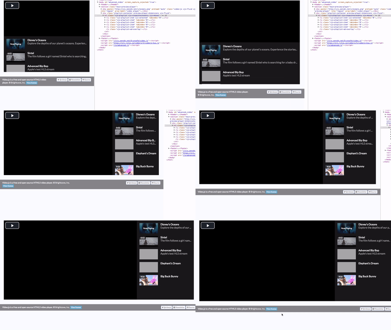
Video.js 5's fluid mode and playlist picker
In video.js 5.0, we added support for truly fluid layouts with video.js.
You can see an example of it on the video.js website.
It is done by using intrinsic ratios. Video.js does the heavy lifting for you.
In video.js, to make a player fluid, you can either set the fluid option
let player = videojs('preview-player', {
  fluid: true
});
Or you can add one of the fluid classes to the player: .vjs-fluid, .vjs-4-3, .vjs-16-9:
<video id="preview-player" class="video-js vjs-fluid" controls data-setup={}>
.vjs-4-3 maintains a 4:3 aspect ratio for the video and .vjs-16-9 maintains a 16:9 one. .vjs-fluid is a bit more special. It waits for the video metadata to load and then uses the video width and video height to calculate the correct aspect ratio to use for the video.
This works great if you only have the player by itself. What if you are trying to a attach a playlist to the video element and keep it at the same height Like we did on the advanced example page on the video.js website?
We could calculate how much the padding top should be depending on the width of the playlist picker or the container element but then each time a video changes we would need to recalculate the height of the playlist picker. Instead, we can rely on video.js to do all the work.
For this example, We're using the videojs-playlist-ui and videojs-playlist plugins for the playlist functionality.
We then wrap the player in a container and put the playlist-ui element in there as well.
<section class="main-preview-player">
  <video id="preview-player" class="video-js vjs-fluid" controls preload="auto" crossorigin="anonymous">
    <p class="vjs-no-js">To view this video please enable JavaScript, and consider upgrading to a web browser that <a href="https://videojs.com/html5-video-support/" target="_blank">supports HTML5 video</a></p>
  </video>

  <ol class="vjs-playlist"></ol>
</section>
Now we can relatively quickly make them align together with some CSS:
.video-js {
  width: 70%;
  float: left;
}
.vjs-playlist {
  width: 30%;
  float: right;
}
As you can see in the preceeding screenshot, it isn't aligned correctly with the player like in the screenshot above.
Video.js calculates the aspect ratio and then adds a stylesheet to the page:
.preview-player-dimensions.vjs-fluid {
  padding-top: 41.66666666666667%;
}
That percentage results in a 2.4 aspect ratio which matches that of the oceans clip.
So, to make sure that the playlist picker is the same height, we can just add the player dimensions class to it:
<ol class="vjs-playlist preview-player-dimensions vjs-fluid"></ol>
One of the easiest ways of making these two things line up correctly is to use flexbox. It'll make the player and playlist picker grow to fill up as much space as needed. Also, the playlist picker collapse underneath the player if the width of the page is too small.
Flexbox is available on a lot of platforms. However, some browsers were implementing flexbox as the specification for it was evolving. It's probably best to run this css through something like autoprefixer. Using autoprefixer won't make it work on browsers that don't support flexbox but will significantly increase platform support.
First, we set display to flex and add some properties for wrapping and sizing:
.main-preview-player {
  display: flex;
  flex-wrap: wrap;
  justify-content: space-between;
}
flex-wrap allows playlist picker to wrap to the next line if the width of the container is too small.
Then we want to position the player and playlist picker relative to the container and set some default and minimum sizes:
.video-js,
.vjs-playlist {
  position: relative;
  min-width: 300px;
  min-height: 150px;
  height: 0;
}
And finally, we want to apply the flex setting to the player and playlist picker:
.video-js {
  flex: 3 1 70%;
}

.vjs-playlist {
  flex: 1 1 30%;
}
This tells the player to grow and take up 3x the space as the playlist picker and defaults to 70% of the width. The playlist picker itself defaults to 30% of the width and is allowed to grow and shrink as necessary.
Now if we load this in a browser we see a problem. The playlist isn't the right height:
This is because the playlist-ui plugin sets its own padding on the element that ends up overriding the preview-player-dimensions padding-top. We can fix this by forcing the padding-top we want. However, while this solves our height problem, where are our items? Oh, you need to scroll to get them. That seems less than ideal.
This happens because our padding-top is inside the playlist picker; it pushed all the elements down requiring scrolling to get to them.
Ultimately, what we need to do is wrap the playlist element in a container that flexes so that the padding-top doesn't push the playlist items down.
<div class="playlist-container  preview-player-dimensions vjs-fluid">
  <ol class="vjs-playlist"></ol>
</div>
We also change the vjs-playlist references to playlist-container and absolutely position the playlist picker inside its container:
.playlist-container {
  position: relative;
  min-width: 300px;
  min-height: 150px;
  height: 0;
}

.playlist-container {
  flex: 1 1 30%;
}

.vjs-playlist {
  margin: 0;
  position: absolute;
  top: 0;
  bottom: 0;
  left: 0;
  right: 0;
}
Now we have what we were looking for:
The HTML:
<section class="main-preview-player">
  <video id="preview-player" class="video-js vjs-fluid" controls preload="auto" crossorigin="anonymous">
    <p class="vjs-no-js">To view this video please enable JavaScript, and consider upgrading to a web browser that <a href="https://videojs.com/html5-video-support/" target="_blank">supports HTML5 video</a></p>
  </video>

  <div class="playlist-container  preview-player-dimensions vjs-fluid">
    <ol class="vjs-playlist"></ol>
  </div>
</section>
And the CSS:
.main-preview-player {
  display: flex;
  flex-wrap: wrap;
  justify-content: space-between;
}

.video-js,
.playlist-container {
  position: relative;
  min-width: 300px;
  min-height: 150px;
  height: 0;
}

.video-js {
  flex: 3 1 70%;
}

.playlist-container {
  flex: 1 1 30%;
}

.vjs-playlist {
  margin: 0;
  position: absolute;
  top: 0;
  bottom: 0;
  left: 0;
  right: 0;
}